Gulo - a complete brand system for a new outdoor survival label
The challenge
Gulo is a new direct-to-consumer outdoor survival brand of our own (a Media Dreams venture, not a client engagement), built from a blank page. The brief we set ourselves covered the full journey from commercial opportunity through to a finished visual identity: pick a name and a story worth telling, work out which products could actually compete on Amazon FBA and which belonged in a higher-margin online store of our own, and then build a visual identity credible enough to sit next to category incumbents who’ve had decades to earn their reputation.
Why a wolverine
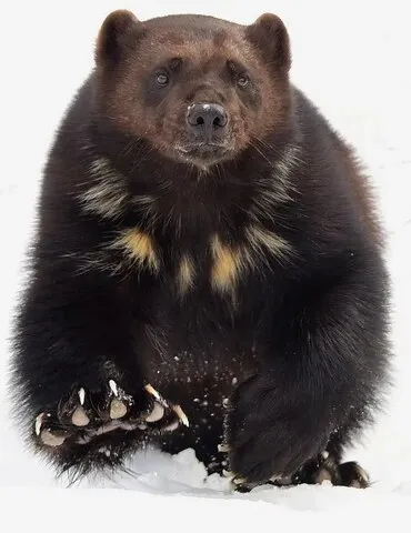
The name comes from Gulo gulo, the scientific name for the wolverine, pound for pound one of the toughest animals alive: a creature under 18kg that routinely drives bears and mountain lions off a kill, and can cover 40km a day through deep snow. Most brands in this category default to one of two looks: military-adjacent (cold, grey, aggressive) or lifestyle-outdoor (earthy, recreational), and neither captures genuine survivalism: the refusal to quit, regardless of conditions. The wolverine gave Gulo a mascot with instant credibility among anyone who knows it, without being so overused in the category that it reads as generic.
That translated directly into a brand personality: relentless, uncomplicated, and trusted: gear that refuses to fail when conditions get extreme, with no wasted weight or unnecessary features, built to a standard people talk about. The tagline, Built Savage, carries both halves of that at once: engineered with intent, and the animal, the environment, the attitude behind it.
Product research & channel strategy
Rather than pick products on instinct, we built a dual-channel framework: which products suit Amazon FBA (light, sub-£30, high search volume, low return rates) versus which belong on our own online store where a brand story can justify a higher price. That produced a twelve-product pipeline across six categories (fire, light & energy; cutting & tools; water & shelter; navigation & signalling; carry & pack; and warmth & first aid), with a recommended three-product launch sequence (a ferro-rod multi-tool, a wallet multi-tool, and heavy-gauge emergency blankets) chosen specifically for fast cashflow and early review accumulation.
Brand strategy
The positioning deliberately sits between genuine survivalism and premium outdoor craft, closer in spirit to Morakniv, LifeStraw or Silva than to militaria or lifestyle-outdoor labels. The tone of voice follows one rule: earned, not performed. Copy is short, specific and verifiable: “10,000 strikes. Full tang. No shortcuts.” rather than “experience the ultimate adventure companion.” If a claim can’t be backed with a number or a fact, it doesn’t go on the pack.
Visual identity development
Six distinct logo directions were developed and evaluated on their own merits: from an aggressive claw-mark wordmark to a hexagonal patch-style badge, a premium monogram suited to embossing and foil stamping, a biologically accurate paw-print mark, a contemporary wordmark-with-spine treatment, and an abstracted mountain-ridge silhouette drawn from the wolverine’s own profile.
The primary mark (a front-facing wolverine head) went through more than fifteen structured iterations, each critiqued against real wolverine anatomy rather than the bear-like default most image generation tools reach for: a flatter, wider skull, small low-set ears, an elongated mustelid muzzle, a heavy brow, and the wolverine’s distinctive sweeping facial mask. That discipline produced a final reference image accurate enough to brief a vector illustrator against directly, plus a full logo asset set (colour, black, white and amber variants, a wordmark lockup in Barlow Condensed, and silhouette versions for stamping, embroidery and single-colour print), tested for legibility from an 8mm emboss up to a 3-metre exhibition wall.
Design system & style guide
The finished system was built to survive across every touchpoint the brand will actually meet (Amazon listings, a online store, product labels, apparel, embossed hardware, trade show stands), tested against one question throughout: does this still work at 8mm, and at 3 metres?
The palette is deliberately warm-dark rather than the cold grey-and-blue that dominates the category: Wolverine Black, Amber Fang and Claw Gold drawn from the animal’s own colouring, paired with a single type family, Barlow, at two widths: condensed at weight 800 for every heading and product name, regular at 400 for body copy.
A consistent product-label architecture (amber edge stripe, mark top-left, one verifiable spec line, the Built Savage tagline running vertical) means every SKU reads as unmistakably Gulo, whatever the packaging format.
The system applied to a storefront
Mockups, not a live build yet (the online store itself is one of the next steps below), but applying the finished system to a realistic storefront is how we checked it actually holds up as more than a logo and a palette: real navigation, product cards, pricing and trust copy.
Outcomes & next steps
gulo.com moves into launch with a complete, production-ready brand system rather than a logo and a hope: naming, positioning and voice; a twelve-product pipeline with channel allocation already mapped; a full identity system with usage rules; and a creative brief ready to hand a freelance illustrator for final vector artwork. The remaining steps are deliberately small and sequenced: commission the final illustration, apply it to the label templates, and launch the first three FBA products while the online store store is built out against the same design system.
Why it’s worth including
It’s another example (alongside Spotlight.me) of Media Dreams doing complete product and brand work on its own account: commercial strategy through to a finished, production-ready identity system, with the same rigour we’d bring to a paying client’s brief.
← Back to all case studies