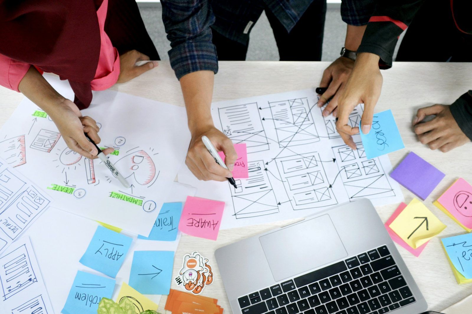
The finished product rarely matches the Figma file exactly. Usually that’s not because developers are careless. It’s because the file answered the question “what does this look like?” but not “what does it do?” A good handoff answers both, and it runs through the whole project as a conversation, rather than happening once at the end.
Why designs drift on the way to code
- Only the happy path was designed. The screen looks perfect with a short name and three items. Nobody drew the long name, the empty list, the error, or the loading state, so the developer had to guess.
- Values don’t match anything. A grey of
#6B6B6Bhere and#6C6C6Ethere, padding of 15px on one card and 16px on the next. The developer either copies every odd value, or rounds them to the nearest thing that exists, and the design “changes”. - Behaviour lives in the designer’s head. What happens when you click outside the menu? Does the form check as you type, or on submit? Where does keyboard focus go when the dialog closes?
- Screens are designed at one width. Then the browser is 390px wide, or 1,600.
What a good handoff includes
1. Designs built from shared parts
If the design uses the same components and design tokens that exist in code, most of the handoff is already done. “Primary button, large” and “spacing medium” need no measuring. This is the single biggest improvement a team can make, and it’s what a design system is for.
2. Every state, including the awkward ones
For each screen or component, check you’ve drawn:
- empty, loading, partly filled and full
- error and success
- hover, keyboard focus, pressed and disabled
- long text, short text, and text in other languages if you’ll translate
- the smallest and largest screen widths you support
3. Annotations for behaviour
Short notes beside the design, written for a developer: what triggers what, what’s announced to screen readers, where focus moves, what the keyboard does, and any rules (“show at most five, then ‘see all’”). Figma’s Dev Mode has annotation tools for this, but a sticky note works too. What matters is that it’s written down next to the thing it describes.
4. Real content
Lorem ipsum hides problems. Real headlines are longer than you think, real names have accents, and real prices have decimals. Design with the real thing, or at least the realistic worst case.
5. A way to say “done”
Agree what “built as designed” means before building starts: the states above, the widths, contrast and keyboard checks. Then the designer reviews the built version against that list, not against their memory of the file.
What developers need from Figma itself
- Dev Mode shows measurements, colours and generated code for whatever is selected. The code is a starting point, not something to paste in.
- Variables (Figma’s word for tokens) let developers see
color/action/primaryrather than a hex value, so they reach for the right token in code. - Auto layout makes designs resize the way code does, so the developer can see how a component stretches and wraps.
- Ready for dev sections mark which parts are finished, so nobody builds a screen that’s still changing.
Better still: prototype in code
For anything interactive, the most reliable handoff is to skip part of it. A prototype built in code with the real components shows exactly how things behave, can be tested with users, and becomes the starting point for the real build. It’s how we work on most projects, and it’s why our own documentation, Somnia DS, shows working components rather than pictures of them.
A quick checklist
- Built from the design system’s components and tokens
- All states drawn, including empty, error and loading
- Smallest and largest widths shown
- Behaviour and accessibility annotated
- Real or realistic content
- Agreed definition of “built as designed”, and a review against it
Losing detail between design and build? Get in touch. Fixing handoff is usually a few small habits, not a new tool.
← Back to all insights